
 Well, the World Cup of soccer is under way, or if you prefer, football or even futbol as it is known outside North America. Over here in Canada and USA it is known as soccer to distinguish it from the North American sport of football (NFL and CFL), you know , the sport that is played with an oval pigskin ball that is carried in a player's hands for 95% of the game. I would like to know who the brainiac was who decided to name a game that is played almost exclusively with the hands, "football". Nice goin' Einstein! With that kind of logic, I guess baseball, had Abner Doubleday thought of it, could have been called football. Hell, why not? I see a baseball player accidently kick a ground ball once in a blue moon. Sounds like football to me! I heard that basketball was almost called hockey but there is no goaltending allowed so James Naismith (a Canadian) reluctantly called it basketball. What a loon eh? I wonder how he came up with that. You don't think it has anything to do with the fact that basketball is played with a ball and a couple of baskets do you? Wow, that might have been just crazy enough that it stuck. But I digress. I suppose soccer or futbol could have been called headball since players use their heads to pass and score also. Nah. The countries overseas had it right from the very start. A sport that is played almost exclusively with the feet is called football. You don't need to scratch your head for that one.
Did you know that the word soccer is an abbreviated form of the word association? When the game came over to North America it was known as association football. However, over here in North America it needed a different name to distinguish it from American football so association was shortened to soccer and the word football was dropped.
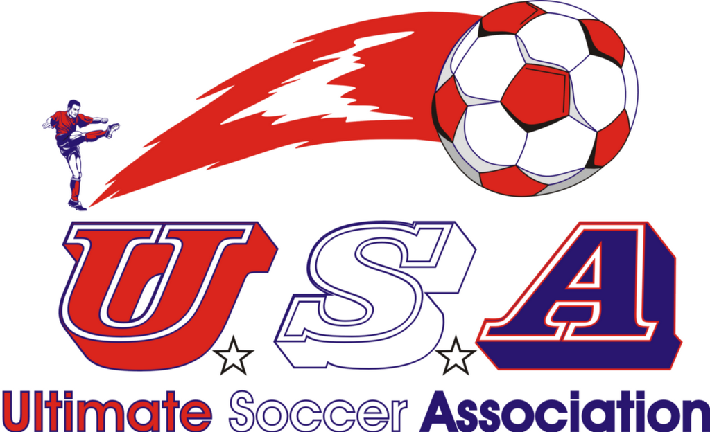
Which brings me to my USA World Cup design you see at the top of this post. It is not so much an official World Cup design as it is a tribute to the American team playing in the World Cup since my Canucks failed to qualify once again. USA takes on another meaning as it also represents the Americans quest to become the Ultimate Soccer Association. The player above the USA text is decked out in US colours and strikes the ball with a mighty kick sending the ball soaring with a rocket's red glare stretching across the USA. The soccer ball also sports the American colours and the two white stars also add a nice touch. Finally, in the good ol' Red, White and Blue are the words Ultimate Soccer Association to match the USA text above it.
 Even though Canada has failed to qualify once again for the World Cup, that is not going to stop me from posting my design for the Canadian team. It was twenty years ago that Canada played in its first and only World Cup appearance. They played three games, lost all three and never scored a goal. They allowed five goals in total. I was 17 at the time and it was exciting that they had finally made it to the big dance. Even though I wasn't happy with the results I was proud the way they played. Here is hoping that four years from now they will return.
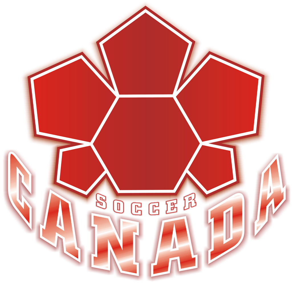
Anyway, the design above is actually something I designed originally for the Canadian Soccer Association a couple years ago. Their website had advertised a contest for people to submit their designs as they were searching for a new and updated logo which was a surprise to me as I quite enjoyed the original logo. However I wasn't going to let nostalgia get in the way of me getting a chance to show my worth and possibly come up with the winning entry. It was a challenge to which I was looking forward. I had a rough idea right from the start of what I wanted to incorporate into the logo. But even though it is a simple design, it took me a while to get the darn thing to look exactly like the image I had in my head. I struggled with it for days, editing and re-editing some small detail that I was never quite satisfied with. The font was either the wrong type or the wrong size (too big, too small) or I couldn't get the curved text just right. Finally though, I prevailed and came up with the final version that you see now. But after further investigating the details of the contest, I found out that there was no compensation for the winning submission. No cash prize, no t-shirt or cap, no free tickets to a soccer game even. I'm not even sure they were going to credit the design to the winner. I decided immediately that I was going to keep the logo for myself. I needed to change a couple things to avoid copyright infringement. Originally the text was Canadian Soccer Association and CSA. I simply changed that to a more generic sounding Soccer Canada. Maybe this is why, upon checking the website, I see the CSA still has the old logo. Perhaps they did not get any submissions and are too cheap to pay a designer for a new logo. This might also be the reason why Canada has only made the World Cup once. The soccer program is too cheap.
Now for a brief desciption of the Soccer Canada logo. A bold and graphic red Maple Leaf stands out proudly, front and center. The Maple Leaf is composed of soccer ball panels which as you know are sewn together to form one complete soccer ball. Much in the same way the maple leaf panels are "sewn" together to signify the nation or country of Canada coming together (players
 and fans) to form a complete soccer team and nation. Completing the logo are the words Soccer Canada in a solid red and white font standing on guard for thee.
I also designed what I thought a Soccer Canada flag should look like (at left). I like to imagine this flying high at the top of a flag pole waving proudly in the wind during every Canadian soccer game. What an inspiring sight that would be for all Canadians, players and fans alike. Much like our official flag of Canada, the Soccer Canada flag would have the Paneled Maple Leaf at center on a white circular background which represents a soccer ball. The two red crescents to each side represent two more soccer balls behind the white one symbolizing unity and at the same time a tribute to the two red vertical bars on each side of the flag of Canada. Finally, the white background signifies the purity of the game of soccer and the sportsmanship when played the Canadian way.

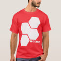
This is a design for all soccer fans in general. Once again it borrows the concept that it is composed of soccer ball panels in traditional black, in this case forming the letter "S". Notice the two connected diagonal panels which lead your eyes in the proper direction, that is if you start your focal point at the top right single panel. From there, let your eyes follow normally as if you were reading the next sentence of a paragraph pretending that there is an indentation in the "S". Your eyes gaze from the top right, down slightly to the very left following down right diagonally in a fluid transition and then back down to the left at the end of the "S" and then straight across horizontally to complete the word "Soccer".
NOTICE:
All designs in this post are property of Caza Creations and are protected under copyright. Please do not copy or reproduce in any way.
And now for something completely different. A lighthearted look at the world of soccer. :)
Soccer Bloopers
No comments:
Post a Comment