Showing posts with label logo. Show all posts

Monday, May 31, 2010

Never Fear. Video Man is Here!


This is a logo I designed for a contest for an online video company whose initials were MV. I didn't win the contest, nor the substantial cash prize that was awarded. However, I was reminded of the saying, "when life gives you lemons, make lemonade."

I tinkered with different ideas of how I could make use of the MV logo. As always, whenever I have a logo lying around doing nothing, I like to throw it on a t-shirt for sale to make a little extra cash. I brainstormed words that began with those initials but I never really came up with anything I liked. It then dawned on me that the letters in the logo were interchangeable and that the V could just as easily lead off the name.

When I originally thought up the concept for the contest, I wanted to incorporate the initials to look like three video control buttons you might see for an online video player. Obviously, these buttons' functions are purposely vague. Their real function is to morph into the MV letters. Long after losing the contest, I realized it could be VM.

Sticking with the video theme, I came up with the name Video Man. Immediately, an image of a superhero sprang to mind.

Narrator voice: "Able to view movie marathons in one sitting. Stronger than the toughest movie critic. It's video Man!"

I thought maybe his secret identity could be a video store clerk. Heck, Video Man could even be the name of the video store itself. He could then be the official mascot of the company.

What do you think? Do you see a movie franchise in Video Man's future, as Spider-Man and Batman have done?

Tuesday, May 04, 2010

Hockey Blades on Myspace

Copyright (c) 2010 BLADES
The skate with the sharp shape is now on Myspace. Hockey BLADES now has its own account at the social network to help spread the word to the hockey world.

The new site allows hockey coaches, managers, team owners, schools and even fantasy players to adopt the BLADES hockey skate logo as their own. Visitors can do this by choosing customizable jerseys, t-shirts, embroidered caps, etc. and adding a location, school name or fantasy name to the logo. This enables you to have your very own, non exclusive, official team merchandise.

To get your merchandise in time for the next hockey season, visit Hockey BLADES on Myspace, today.

What jersey colours would you like to see added? Do you have an idea for a BLADES theme? Want the logo in your country's or school colours? Post your ideas below in the comments.

Friday, July 17, 2009

Hockey Blades


I have opened up a new gallery at T-Shirt Monster called Hockey Blades. This gallery will be the primary location of all the different versions of my Blades hockey skate logo. I had been uploading them to my main gallery but decided that I had enough variations to warrant a gallery of its own.

Several countries are represented with their respective flag themes. If you don't see your country among the choices, leave a comment to this post to let me know which country you would like to see added.

Tuesday, August 26, 2008

Re-branding Caza Creations


MyFreeCopyright.com Registered & Protected
If you have visited here before, you may notice that Caza Creations has a new logo and banner as well. Actually, the logo is a cleaned-up and modified version of the previous logo, with a much bolder look that better represents what Caza Creations is about.

The wordmark Caza Creations is now at the forefront of the design with the familiar "double c" in the background. The coulours have changed a little bit, starting with the logotype which has a hard-edged, horizontal gradient of two shades of blue. It has a thick navy blue outline whereas the old logotype had a thin white outline. Also, the logotype no longer uses the "double C" logo as the first letters of each word, instead standing out on its own.

As mentioned, the C within a C logo is placed behind the logotype forming an instantly recognizable background and completing the overall logo's appearance. This also has an even thicker, navy blue outline and the fill is a green and blue, radial gradient.

The banner itself remains a work in progress but for now I think this one is a considerable improvement over the former one. Even though the old banner had a cool appearance, I feel it conveys a better message of what Caza Creations provides. However, I am not 100% satisfied with it and will be tweaking it again once I know what direction I want to go.

I also have a simple black and white version of the logo for advertising purposes.
MyFreeCopyright.com Registered & Protected

What effect will this have on Caza Creations stores? Well, currently I am in the process of re-branding each store that you see situated directly underneath the banner of this blog. The goal is to try to give a uniform look to each store as much as possible, starting with the logo and banner. I haven't gotten a chance to update them all yet as I still have the old banners up for Cafepress, Spreadshirt and Squidoo. Eventually I will get around to changing those to the new banner. Hopefully, this will create a more recognizable brand identity, one that customers will come to know and remember.

Wednesday, August 15, 2007

Cup Your Balls

I just finished a new beer pong design with the slogan, "Cup Your Balls".


I gave the image and text a nice neon sign appearance and find that it suits the subject well. This design is best suited on a dark background, preferably black so if you think you might order a t-shirt, I would suggest sticking with a dark colour.

Tuesday, August 14, 2007

Commissioned Work


Here is a design I was commissioned to do last week for a woman who had advertised on the Cafepress forum that she needed a graphic designer for a t-shirt design she had in mind. I replied to her post and after a few exchanged e-mails and negotiated price, I offered to do it and she accepted.

In one of her e-mails, she described in detail what the design was that she had in mind. Her literary agent was taking a bunch of his clients on a retreat and she wanted 30 t-shirts for the event in two weeks.

Her concept was to do a caricature cartoon character of her agent, standing in a wide stance, clutching a fistful of money in one hand and cradling a book in the other. She provided me with an attached photo of her agent in an e-mail to do the caricature. He also had to be wearing a utilikilt and sunglasses and she wanted text to read "Secret Agent Man". Also, the name of the book had to be titled, "Pork Rinds On My Mind by Team Barry". If you are like me and wondering what a utilikilt is, have a look here.

After getting all the details, I proceeded to commence designing. I should point out that originally, instead of the book, she wanted a bag of pork rinds. I had already designed the bag when she e-mailed with the design change. Fortunately this was not a huge revision and I was easily able to make the switch. Because of her vivid description, I had a good mental image of what I thought she wanted and after a few hours, I had a first draft. My next step was to send her a copy for her (hopefully) approval and to go ahead with placing it on the t-shirts. When I sent her the image, I nervously awaited her reaction. Shortly thereafter, this is the response I received from her:

"OMIGOD I LOVE IT!!!!! It is all I wanted and more. By blind
wonderful luck, we stumbled on JUST the right designer. You rock!!!!"

"Oh, it's absolutely MORE than we hoped for. It's awesome! I'm sure I'll
have you do other fun designs for me in the future, if you're up for it!"

I was real happy that she was really pleased with the design. She did have a couple of small suggested revisions that I happily made and then had a final draft to place on t-shirts. Once the t-shirts were designed, I sent her a private link and by the next day, she ordered 30 t-shirts.

This job was a pleasure to do because the client knew exactly what she wanted and described in vivid detail what it was she wanted. This is extremely important when you need a designer to do a job for you. The more info you provide, the better the chances are you'll get the image you had in mind. Help your designer help you and everyone ends up happy.

If you or anyone you know is in need of a Graphic Designer for any type of job, please feel free to get in contact with me. I would be more than happy to discuss any project ideas you have and my price is always negotiable.

Saturday, June 09, 2007

London Logo Falling Down?

The recently unveiled logo for the 2012 London Olympics has barely had a chance to get settled in but has already fallen on hard times.

First there was its general appearance as you see here, that many people were very critical about. The logo is somewhat of a departure of Olympic logos of the past.

The design features four abstract shapes, each representing the numbers 2012, with the city's name placed inside the first number and the familiar Olympic rings centered on the numeral 0.

Now comes the news that a promotional video of the logo, in animated form, placed on the 2012 website, has triggered epileptic seizures in several people, angering the city's mayor. The video has since been removed but the mayor is still steaming, along with many others. The mayor has suggested that the design firm responsible for the fiasco, not be paid for their services. Also, a petition has been started to get the logo changed. so far 49,000 have signed the Change The London 2012 Logo petition.

I don't see what people are complaining about. Yes, some people suffered some epileptic seizures but where were these critics when it was time to remove Mary Hart from the TV airwaves for her part in Kramer's suffering:

Kramer Suffers Seizure


What do you think of the London 2012 Olympic logo?
I love it! Very original.
I hate it! Picasso was never my favorite.
It's ok, but nothing special.
Seizure just kicked in, I'll let you know later.
Kramerica should have designed it.
  
pollcode.com free polls

Friday, April 13, 2007

Quebec Nordiques' Old/New Logo

To the left is the logo of the Quebec Nordiques when that city was part of the National Hockey League. Nordiques is a French word which translates into English as "Northerners"or "from the north". At the time Quebec was the northern most city in the NHL.The logo was a lower case red letter "n" outlined in blue with a red hockey stick to its right and a blue hockey puck above that. Paying tribute to the north theme, the "n" and the hockey stick combined to form the profile of an igloo, with the blade of the hockey stick forming the opening of the igloo.

From 1979-80 to 1994-95, this was the only logo ever used by the Nordiques during its NHL stay before the franchise was sold and moved to Colorado, becoming the Avalanche. However, had the team not moved and stayed in Quebec, what a lot of people don't know is that the Nordiques were all set to take to the ice in '95-'96, in a completely new uniform design, including color scheme and logo. To the right is the logo that would have adorned their jerseys for the next season, had there been one. It appears to be a snarling wolf's head emerging from a blue triangle with the name Nordiques across the bottom. The letter "I" is in the shape of an icicle. Overall, the predominant colours of the logo are blue and grey, giving it a frosty mood.. This logo has a more harsh and cold look to it with all its angles and jagged points.

The new uniforms, with the new logo would have looked like this:
White Jersey
Blue Jersey

When the Nordiques moved to Colorado in 1996, The Avalanche went with their own logo and colour scheme, thus the new Nordiques' jerseys were never needed and never manufactured, existing only on the drawing board and never to be seen by the hockey-going public.

In a way, I am glad the Nordiques moved to Colorado. That is not to say I wanted the team to move. The Nordiques were part of , in my opinion, one of the greatest sports rivalries in history. Games between the Nordiques and the Montreal Canadiens are legendary. So this was a huge loss, I think. However, looking at that new logo and uniform, I can't warm up to them and prefer the originals a lot more. They're a little more creative and fun in my opinion and I'm glad the Nordiques never got the chance to use the new ones.

Habs vs Nordiques

Monday, April 02, 2007

New Oscar Spot Stuff!

The Oscar Spot has unveiled new merchandise designs that are now available. Three Oscar Fish is a design based on the banner logo of The Oscar Spot website. It features the familiar three oscar fish in a watercolour style graphic and is featured on many products to chose from, including mugs, t-shirts, stickers, hats, stamps, greeting cards and more. Check them out and browse around for a while. Now that hits the spot!


buy unique gifts at Zazzle

Monday, March 05, 2007

Beer Pong

Beer Pong is a drinking game popular with the college crowd. It involves setting up a number of beer cups (house rules determine how many) at opposite ends of a table in a pattern similar to bowling pins.Two teams usually consisting of either a single competitor each or a doubles team compete against each other at one time. The object of the game is for each team to stand at opposite ends of the Beer Pong Table and take turns trying to throw a ping pong ball into one of the opposing teams' cups, which is filled with beer. If the team throwing the ball makes a successful shot, the other team must drink the beer into which the ping pong ball has just landed. The first team to force the other team to drink all their beer is the winner.

Remember, the object is to sink them, not drink them, although some might think that this motto is flawed and that the losers are really the winners. Try this on St.Patrick's Day and see what kind of reaction you get;)

How To Play Beer Pong


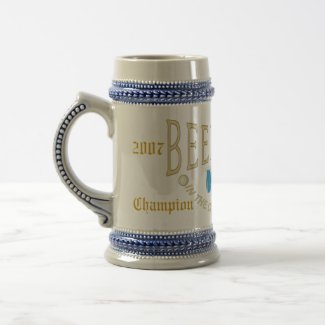
So now that you know how to play the game, do you think you have what it takes to be Beer Pong Champion? In the cup, bottom's up! If you are good enough and lucky enough, maybe one day you'll be able to hoist this Beer Pong Champion Stein over your head, proclaiming you to be the King of Beer Pong! Then you can hoist it up to your lips, the cup filled with celebratory ice cool beer, and sip from the cup of champions. Beer Pong Champions!


The Making Of A Beer Pong Table


Beer Pong Swag

Thursday, January 25, 2007

Attention All Fish Heads!

I took a fish head out to see a movie. I didn't have to pay to get it in. However,they are not good dancers.

Fish Heads


The Oscar Spot

Saturday, October 21, 2006

Great Big "C"


"C" is for Canada. When you think of Canada, most people think of hockey. Hockey and Canada go together like pancakes and maple syrup. Mmmmm....pancakes! Keeping this in mind, I wanted to design a logo that represented these two things that are close to my heart. I knew I wanted something bold and sharp. It had to be simple yet still have an understated look to it. What I came up with is my "C" is for Canada logo.

I got the inspiration for this design from the original Vancouver Canucks logo. The Canucks logo comprised of a hockey rink with a horizontal hockey stick that combined to make a letter "C". After all, what better way to represent a Canuck than with a hockey rink and stick?

Similar to the Canucks logo, mine also had the outline of a hockey rink as a background. Unlike the former, the hockey stick was replaced with a patriotic Canadian Maple Leaf at "center ice" with a channel exiting out to the right of the rink, forming a large red letter "C". Also, instead of Vancouver's colours of blue and green, I naturally used the colours of our national flag, something all Canadians can identify with. I purposefully kept this design simple and easy as I wanted a design that was easily identifiable from any distance viewed, near or far. The result is a crisp, clean logo that is a throwback to hockey logos of the past.

I imagine this logo adorning the jersey's of the Canadian men's Olympic hockey team or maybe flying high at the top of a flag pole as Canada's second flag, letting everyone know that "C" is for Canada.


Monday, September 11, 2006

Retro Hockey Canada


Retro Canada Cap
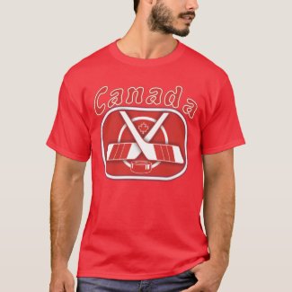
What are your memories of great feats in Canadian hockey history? Is it the Canada/Russia Summit series of '72? How about the 1976 Canada Cup tournament? Maybe it was the Rendez-Vous '87 in Quebec. Whichever it is, this classic retro logo is designed in the style of the old classic hockey logos and is inspired by the clean simple designs that defined the style of the '70s and '80s. At first glance, you are immediately taken back to yesteryear on a trip down memory lane. Your patriotic feelings are stirred up as you can almost hear the voice of Foster Hewitt as he announces, "...scores!Henderson has scored for Canada!!!"

Henderson Has Scored For Canada!

Wednesday, April 19, 2006

Amherst Iceburgs- 2005-06 Champions!


Well, finally after 4 years and three trips to the finals, I have won our hockey pool from work.
WOOHOO!!! After a 2nd place finish in 2001-02, 3rd in 2002-03 and 2nd again in 2003-04, the Amherst Iceburgs are the 2005-06 UJFHL Champions! It was a bitterly fought finals over the last 2 weeks with a very worthy opponent, Leafs Blow (nice name...). Although the final score was 9-1, it does not reflect how close each stat category was. I have to say that Sidney Crosby really came through for me in the clutch and has to be maybe the best pickup off waivers I've ever made. Thanks to Aging Buds for putting him on waivers!!

For the first time in UJFHL history an actual trophy will be presented this time to the winner. The Sixpack Cup had always been a virtual reality
trophy until now.


The UJFHL is proud to present the Sixpack Cup to the Amherst Iceburgs!

Remember, 90% of an iceberg is under water so you may think you see me coming but then BOOM!!! I hit you before you know it!