

Top 5 Logos
These are the top 5 logos of the proposed World Hockey Association that was slated to begin for a 2004-05 season. The new league which originally ran from '72 to '79, was supposed to be a rival to the NHL, as it was in the '70s and was planning to take full advantage of the NHL Lockout the same season, allowing it to gain hockey starved fans. Bobby Hull was named commissioner. Eight cities were awarded franchises but only five actually named their teams and had logos designed. Those are the five below. The remaining cities to be awarded franchises were Hamilton, Miami and Vancouver.
The new WHA never got off the ground and the NHL eventually resolved the lockout leaving us to wonder what would it have been like? Thanks to these 5 logos below, we have a small sampling. Click on the logos for larger images. Enjoy!
1.Detroit Gladiators

The clear cut winner of the bunch, the Gladiators logo is reminiscent of a classic hood or grille ornament that would not look out of place on one of the Motor City's line of cars. Featuring a fierce gladiator holding a shield in his left hand and wielding a hockey stick in place of a sword in his right hand, this logo looks like it means business. Check out the size of his arm. If it came down to a hand-to-hand combat, this guy looks like he would have no problem handling himself on the ice with or without his paraphernalia. The silver, black and white colours give it a metallic feel, again, perfect for that car emblem look. Completing the design is the team name in text that is just underneath the gladiator. The text has a curved effect and has a sword featured in the middle of both words doubling as the first letter "T" in Detroit (the hilt part) and the rest of the blade representing the letter "I" in Gladiators.
Out of the 5 WHA logos, this one is in a league of its own.
The next four logo designs don't fare as well as the one above, although there are a couple decent efforts.
2.Quebec Nordiks
 When the city of Quebec was awarded a WHA franchise for the second time, it was decided that they would renew the name of the original WHA and former NHL team, Quebec Nordiques. However, due to the NHL retaining the rights to that name, the team decided to change the spelling to Nordiks to avoid legal issues.
Not only was the name spelled differently, the whole logo was a complete departure from the old logo. The design consisted of a polar bear wearing a hockey helmet, poking its head through a blue oval ring and slashing through the logo and team name with its left claws. The word Nordiks is strategically written so as to form the tail of the blue oval ring, which together, combine to form the letter "Q" for Quebec. The "O" in Nordiks is a hockey puck.
Overall, this is an o.k. design, however it could be a lot better. The polar bear should have been given a more menacing expression. Aside from the threatening slash, it looks like it just wants to play. There should have been another colour besides the slate blue which gives the impression that this is just a photocopy. I'm still undecided about the idea of the bear wearing a helmet.
The whole "spelled differently name", I'm not crazy about. A new name altogether probably would have been better.
This logo and the next one pale in comparison to #1 but they are still much better and more creative than #4 and #5 , two of the most uninspired designs I have ever seen.
3.Toronto Toros
 This logo is an updated version of the old Toros' logo from the original WHA ('72-'79). They did a nice job with the double T with the bull horns and the bull's eye but the smurf-blue, steroid-injected, hockey stick-wielding bull is totally bull crap. The text logo deserved a better image of an actual bull than this Disney reject. No sir, I don't like it.
4.
 Halifax Icebreakers
Now we are getting to the bottom of the barrel, perhaps the fish barrel, judging by the Gorton's Fisherman in this logo. Reminiscent of the New York Islander's ill conceived attempt at a new logo that was quickly met with disapproval from fans who shouted, "fishstick!", Halifax's logo wasn't much better.
There are no redeeming qualities at all to this logo.The text is horrible. The fisherman is holding a hockey stick, how original. Where is the Ice Breaker? For those of you that don't know, an Ice Breaker is a huge ship specially designed to break ice and create open water channels for other ships to be able to use to navigate the frozen lakes. Wouldn't that have been a more imposing idea for a logo? Picture it. The huge bow of a ship bursting through the chest emblem of the players' sweater, crushing the ice in its path! Even the overall shape of this logo is ugly.
5.
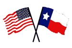 Dallas Americans
Well, what can you say about this uninspired, unoriginal, and totally dull logo. I guess just that. What was the thinking of the owners when they needed a logo for their team? Look through a clip art gallery, that's what.
Look at it. It's the USA and Texas State flags crossed over each other. Genius!! They must have worked on this for hours,no, days. I guess the logo is perfect for their equally inventive team name, the Dallas Americans! Wow. I did not know that Americans were indigenous to Dallas. I guess what they were trying to convey is that Dallas is the home state of Americans. It is what the state is known for. Probably some kind of state bird or animal or maybe it is a produce that they export.
I hope they didn't pay to much for the disk of clip art or hopefully they found use for the rest of the clip art library and got their money's worth.
Don't forget to take this fun little poll and vote for your favourite logo. It's easy! Just think of it as "Logo Idol". Which one will be the Sanjaya of the WHA?
No comments:
Post a Comment