Recently, I have been working on designing a logo for my brother-in-law's fantasy hockey league team, Guelph Knights. I enjoy designing logos any chance I get and when it comes to fantasy sports logos, there are not the usual boundaries most other designs require. When guys come up with a name for their fantasy team, they usually don't attach an actual city name to it like real professional teams and it will usually be something like "Spongebob Hockeypants". There is nothing wrong with this idea, in fact I once named my fantasy hockey team the "Mad Mogs", inspired by John Candy's character ,Barf, in the movie Spaceballs. In the film, Barf declares that he is a Mog, half man, half dog and that he is his own best friend.
I'm A Mog
Another time I named my team the "ReHabs" after my favourite NHL team, the Montreal Canadiens (The Habs), had half their team on the injured list and spent an NHL record amount of time in injury rehab. However, when somebody attaches an actual location to the name it adds another dimension. Also, isn't that really the point of a fantasy hockey team? I am not talking about guys who name their fantasy sports teams after their favourite real professional teams (5 guys in a 12 team fantasy league cannot all be called the Detroit Red Wings, sorry). The object in naming your fantasy team, I always thought, was to imagine what your fantasy would be if you could place a professional sports team in any city (town, village, island) you wanted. Hence the fantasy part. If you wanted to place a team in your hometown, Population 600, then there was nothing stopping you. You don't have to wait for your favourite sports league to go through an expansion and hope that your city is on the waiting list. You don't even have to wait for a financially troubled franchise to relocate to your town either. You fulfill your own fantasy, your own destiny. Which brings me back to the Guelph Knights.
My brother-in-law resides in the city of Guelph, so that was a logical decision in where to place the team and a fantasy, since that city does not currently have an NHL team and as far as I know, is not in contention in the near future of ever acquiring one.
Next, he came up with the name, Knights, inspired by the city's nickname, "The Royal City". Put them together and you have the Guelph Knights. Ta-da!
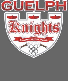
New Guelph Knights Logo
The Design Process
In coming up with this design, the dilemma facing me, was that there were so many directions I could go. My first step was to do some research on the city of Guelph. After a thorough search on the history of "The Royal City" , I incorporated many of my findings into the final design that you see above.
I chose two of the colours, red and white, as a tribute to Guelph's official city flag. I added various shades of silver to represent a knight in shining armor.
The center piece of the design is a knight's shield in white with a castle-inspired design at the top with a silver outline contoured in white. This was a natural symbol or object to chose since Guelph's Coat of Arms also has a shield as part of its design.
The town was founded in 1827(it became a city in 1879) on St. George's Day (the patron saint of England) and was named in honour of a British royal family. For these reasons, I chose an Old English font for the Knights text, using a red fill with a white outline, contoured in silver.
At the inside top of the shield, I placed three red royal crowns for a few reasons. First, the obvious. The "Royal City" is represented. Why three crowns though, instead of a single one? Well, once again, the shield in the city's Coat of Arms features three red crowns on a white background. However, I was not committed to using three until I found out more history about the city of Guelph.
Legend has it, that the hockey term "Hat-trick" originated in Guelph. Hat-trick refers to when a hockey player scores three goals in the same game. It seems that the term came into existence because the Biltmore Hat Company sponsored a hockey team called the Guelph Biltmore Mad Hatters. Whenever a player scored three goals, fans were encouraged to throw their hats on the ice in tribute to that player and soon this feat became known as a hat-trick. There are some who question the authenticity of the story's origin but if you really think about it, it does have merit. No doubt, when a player scored three goals and the fans were encouraged to throw away their hats, I'll bet no one was more encouraging than the Biltmore Hat Company, who were, I'm assuming, only more than glad to replace all those "lost hats" to the newly hat-less fans, at a price of course. Sounds like somebody at Biltmore had their thinking hat on. I hope he got a nice raise.
So coincidence led me to settle on the number 3 for the crowns. After all, what is a crown but a really fancy hat? Thankfully, fans were not wealthy enough to throw crowns around, sparing many a player a knock on the noggin.
The bottom half of the shield design is completed with a red banner placed over two crossed swords hanging over some Medieval Times chainmail.
The upward arched banner, in red, features a motto which reads, "Challenge, Conquer, Prosper" in white with a silver outline.I came up with this motto when I was looking for something to mimic the motto on Guelph's actual Coat of Arms which is, "Faith, Fidelity and Progress", originally in Latin as, “Fides, Professio, Fidelitas.” I thought about what the objectives of a fantasy team owner are and decided that the first would be to challenge someone or some team. Next, when you challenge or accept a challenge, naturally you hope to conquer or vanquish your opponent. Finally, after winning a hard fought battle, the conqueror prospers by either hoisting a trophy, collecting some winnings or both.
The crossed swords are obviously a reference to a knights' duel. Originally I had a different design for the swords but I decided it was too detailed and intricate and I did not want it to be the focus of the design. Instead, I redesigned my own swords with a simple understated look that serves its purpose.
The Medieval chainmail or "chain maille" rings represent the body armor Knights wore to protect themselves from the slashing sword blows from their opponents. The maille has an authentic 4-1 pattern primarily used in Medieval Times. This means that four rings were looped into one and the pattern was repeated until the desired body coverage was achieved.
4 in 1 Chain Mail Pattern
I decided to show six rings which represents the number of players on the ice for one hockey team, being one goaltender, two defencemen and three forwards unified and linked together, playing as one. A chain is only as strong as its weakest link but chain maille spreads out its strength.
Finally, tying the whole design together is the text of the city's name, Guelph. I decided to use a font called Copperplate Gothic Bold, first of all because it sounded cool and second, it just has the right look for what I was going for. I wanted the font for the city name to be different from the nickname but at the same time look like the two were old friends. I also made the city name a larger text because I wanted to instill some pride and showcase the fact that these are the Knights of GUELPH, not just the Knights. I used a two-tone gradient of red and dark red to give the text a chrome-like effect with a silver outline and white contour. This team was founded last year so that is also commemorated in the final design with "est. 2006.
To end on a humorous note , you might be interested to know that there is one little bit of Guelph history trivia that I chose to omit from my final design. It seems that the jock strap was invented in Guelph in the 1920s by a company called Guelph Elastic Hosiery. A contest was held to name the new product and the winning entrant won a whopping five dollars for the suggested name of "jock strap". If that is the case, where did "athletic supporter come from?

Showing posts with label Detroit. Show all posts
Showing posts with label Detroit. Show all posts
Tuesday, July 31, 2007


Sunday, April 15, 2007
Wha Happened?

Top 5 Logos
These are the top 5 logos of the proposed World Hockey Association that was slated to begin for a 2004-05 season. The new league which originally ran from '72 to '79, was supposed to be a rival to the NHL, as it was in the '70s and was planning to take full advantage of the NHL Lockout the same season, allowing it to gain hockey starved fans. Bobby Hull was named commissioner. Eight cities were awarded franchises but only five actually named their teams and had logos designed. Those are the five below. The remaining cities to be awarded franchises were Hamilton, Miami and Vancouver.
The new WHA never got off the ground and the NHL eventually resolved the lockout leaving us to wonder what would it have been like? Thanks to these 5 logos below, we have a small sampling. Click on the logos for larger images. Enjoy!
1.Detroit Gladiators

The clear cut winner of the bunch, the Gladiators logo is reminiscent of a classic hood or grille ornament that would not look out of place on one of the Motor City's line of cars. Featuring a fierce gladiator holding a shield in his left hand and wielding a hockey stick in place of a sword in his right hand, this logo looks like it means business. Check out the size of his arm. If it came down to a hand-to-hand combat, this guy looks like he would have no problem handling himself on the ice with or without his paraphernalia. The silver, black and white colours give it a metallic feel, again, perfect for that car emblem look. Completing the design is the team name in text that is just underneath the gladiator. The text has a curved effect and has a sword featured in the middle of both words doubling as the first letter "T" in Detroit (the hilt part) and the rest of the blade representing the letter "I" in Gladiators.
Out of the 5 WHA logos, this one is in a league of its own.
The next four logo designs don't fare as well as the one above, although there are a couple decent efforts.
2.Quebec Nordiks
 When the city of Quebec was awarded a WHA franchise for the second time, it was decided that they would renew the name of the original WHA and former NHL team, Quebec Nordiques. However, due to the NHL retaining the rights to that name, the team decided to change the spelling to Nordiks to avoid legal issues.
Not only was the name spelled differently, the whole logo was a complete departure from the old logo. The design consisted of a polar bear wearing a hockey helmet, poking its head through a blue oval ring and slashing through the logo and team name with its left claws. The word Nordiks is strategically written so as to form the tail of the blue oval ring, which together, combine to form the letter "Q" for Quebec. The "O" in Nordiks is a hockey puck.
Overall, this is an o.k. design, however it could be a lot better. The polar bear should have been given a more menacing expression. Aside from the threatening slash, it looks like it just wants to play. There should have been another colour besides the slate blue which gives the impression that this is just a photocopy. I'm still undecided about the idea of the bear wearing a helmet.
The whole "spelled differently name", I'm not crazy about. A new name altogether probably would have been better.
This logo and the next one pale in comparison to #1 but they are still much better and more creative than #4 and #5 , two of the most uninspired designs I have ever seen.
3.Toronto Toros
 This logo is an updated version of the old Toros' logo from the original WHA ('72-'79). They did a nice job with the double T with the bull horns and the bull's eye but the smurf-blue, steroid-injected, hockey stick-wielding bull is totally bull crap. The text logo deserved a better image of an actual bull than this Disney reject. No sir, I don't like it.
4.
 Halifax Icebreakers
Now we are getting to the bottom of the barrel, perhaps the fish barrel, judging by the Gorton's Fisherman in this logo. Reminiscent of the New York Islander's ill conceived attempt at a new logo that was quickly met with disapproval from fans who shouted, "fishstick!", Halifax's logo wasn't much better.
There are no redeeming qualities at all to this logo.The text is horrible. The fisherman is holding a hockey stick, how original. Where is the Ice Breaker? For those of you that don't know, an Ice Breaker is a huge ship specially designed to break ice and create open water channels for other ships to be able to use to navigate the frozen lakes. Wouldn't that have been a more imposing idea for a logo? Picture it. The huge bow of a ship bursting through the chest emblem of the players' sweater, crushing the ice in its path! Even the overall shape of this logo is ugly.
5.
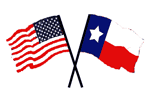 Dallas Americans
Well, what can you say about this uninspired, unoriginal, and totally dull logo. I guess just that. What was the thinking of the owners when they needed a logo for their team? Look through a clip art gallery, that's what.
Look at it. It's the USA and Texas State flags crossed over each other. Genius!! They must have worked on this for hours,no, days. I guess the logo is perfect for their equally inventive team name, the Dallas Americans! Wow. I did not know that Americans were indigenous to Dallas. I guess what they were trying to convey is that Dallas is the home state of Americans. It is what the state is known for. Probably some kind of state bird or animal or maybe it is a produce that they export.
I hope they didn't pay to much for the disk of clip art or hopefully they found use for the rest of the clip art library and got their money's worth.
Don't forget to take this fun little poll and vote for your favourite logo. It's easy! Just think of it as "Logo Idol". Which one will be the Sanjaya of the WHA?
Subscribe to:
Posts (Atom)